Lead Designer
Figma Library
QA and StoryBook
Overview
Optum’s mobile app team faced inconsistencies across various products and features. Design patterns varied by team, making it difficult to maintain a cohesive user experience. Handoff between design and development often involved redundant work, unclear specs, or last-minute changes.
There was no single source of truth for mobile UI components, resulting in:
Slower design and development cycles
Inconsistent UI and UX across features
Communication gaps between designers and developers
Goal
To build a reusable, documented design system tailored for mobile, which would:
Standardize design patterns across teamsStreamline the design-to-development workflow
Empower designers with ready-to-use Figma components
Enable developers with clear, structured documentation
Process
Audit & Exploration
Conducted an in-depth audit of existing mobile screens and components
Mapped out recurring patterns, inconsistencies, and one-off solutions
Collaborated with designers across teams to understand needs and pain points
Component Definition
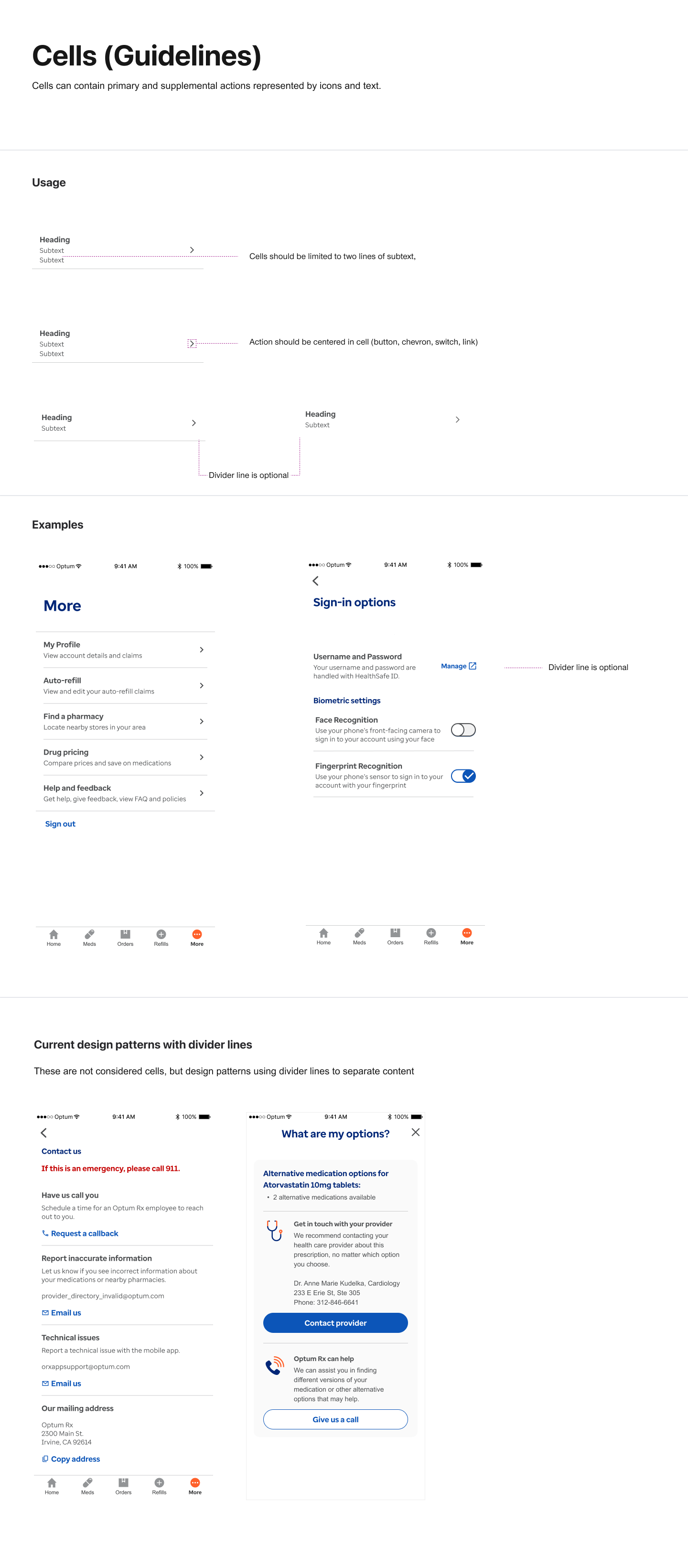
Defined a core set of components (e.g., buttons, input fields, cards, navigation elements)
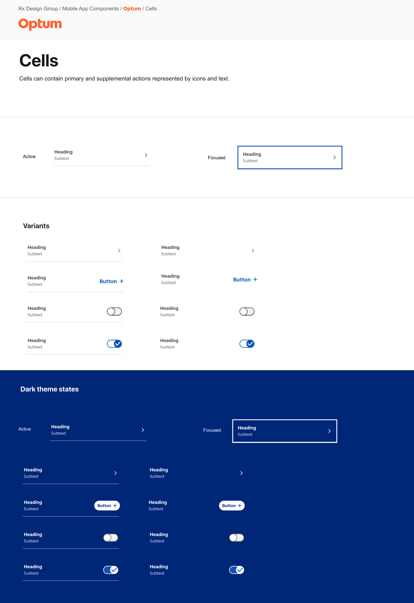
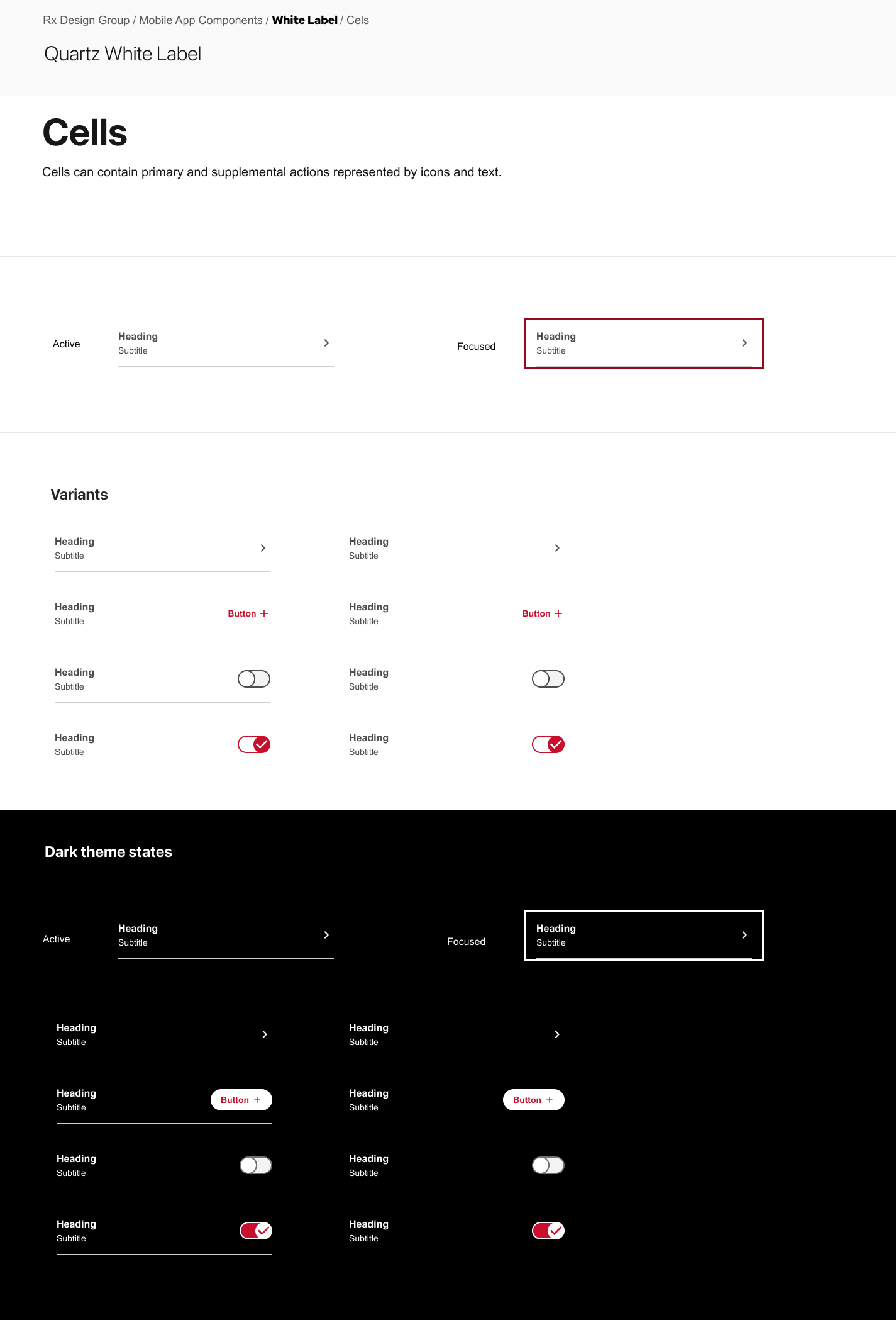
Established usage guidelines, states, and variations (e.g., active, disabled, error)
Ensured accessibility and responsiveness were considered from the start
Building in Figma
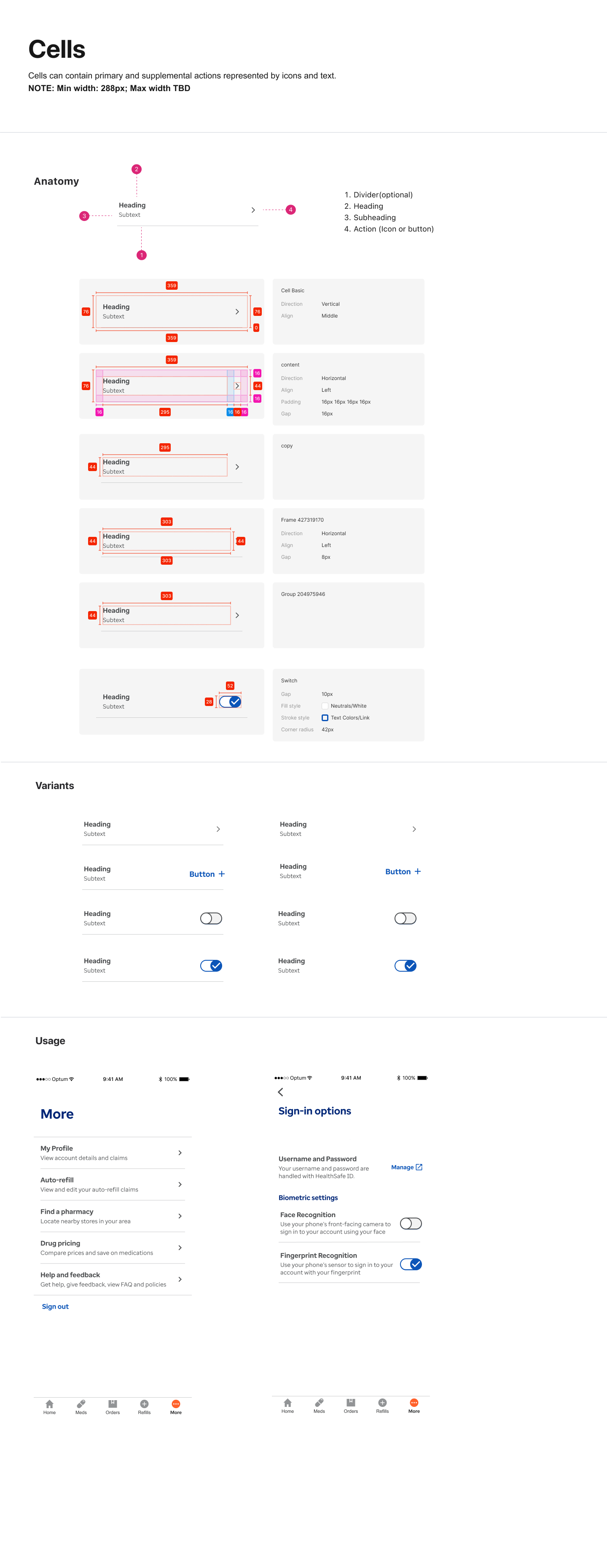
Created a master Figma library organized by component category
Used Auto Layout, variants, and naming conventions for scalability
Documentation for Dev Handoff
Created detailed documentation outlining:
Component behavior and anatomy Design tokens (colors, typography, spacing)Edge cases and platform-specific notes
Collaborated with developers to align on naming, specs, and integration
In addition to documenting the components for the Optum mobile app, I also created white label versions of the components for use on our client applications. Once the component was built then custom design tokens could be used to theme our white label applications
UX Pattern Guidelines
As part of our more refined Design System I created UX Pattern Guidelines to help create more consistency across our web and mobile experiences. These designs were to be made into a website that all new and experienced designers could use when designing.