In an effort to improve our smart home app, I designed and tested new device control ideas. Currently the device controls require two taps and a screen change.
My hypothesis is that users would prefer a 1 tap experience and control all their devices from the dashboard screen.
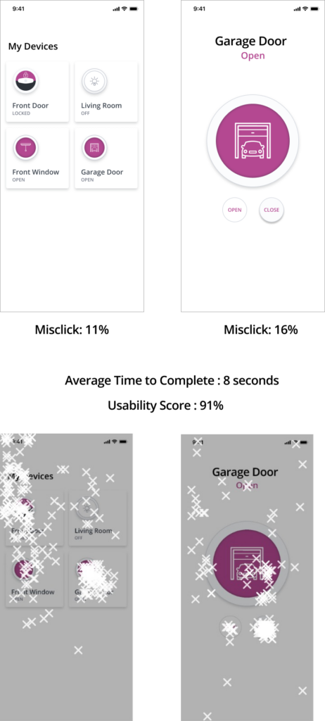
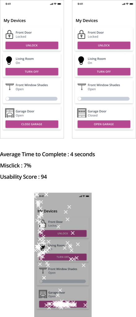
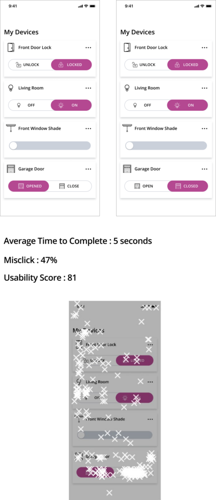
Below are the test results:
Current Design
New Design #1
New Design #2
Dashboard Conclusion
As we see from the results above the single tap designs cut the users time in half and specially New Design #1 had the lowest mis-click rate and highest usability score. This verified the hypothesis I had that by simplifying the device design we could improve usability.
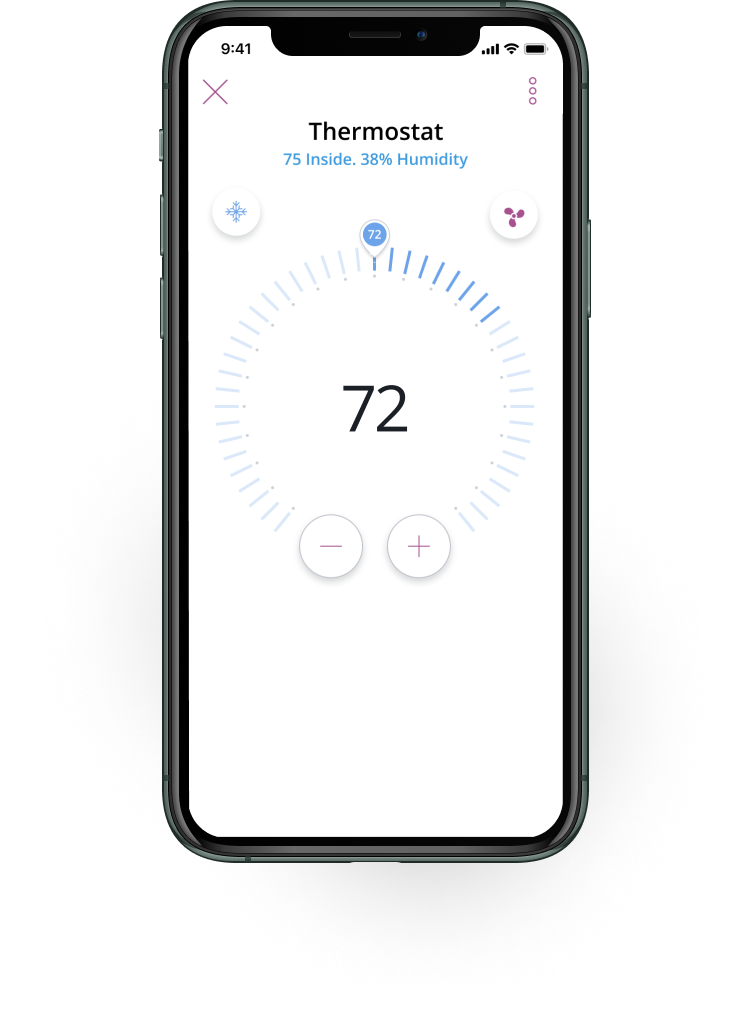
Thermostat Redesign
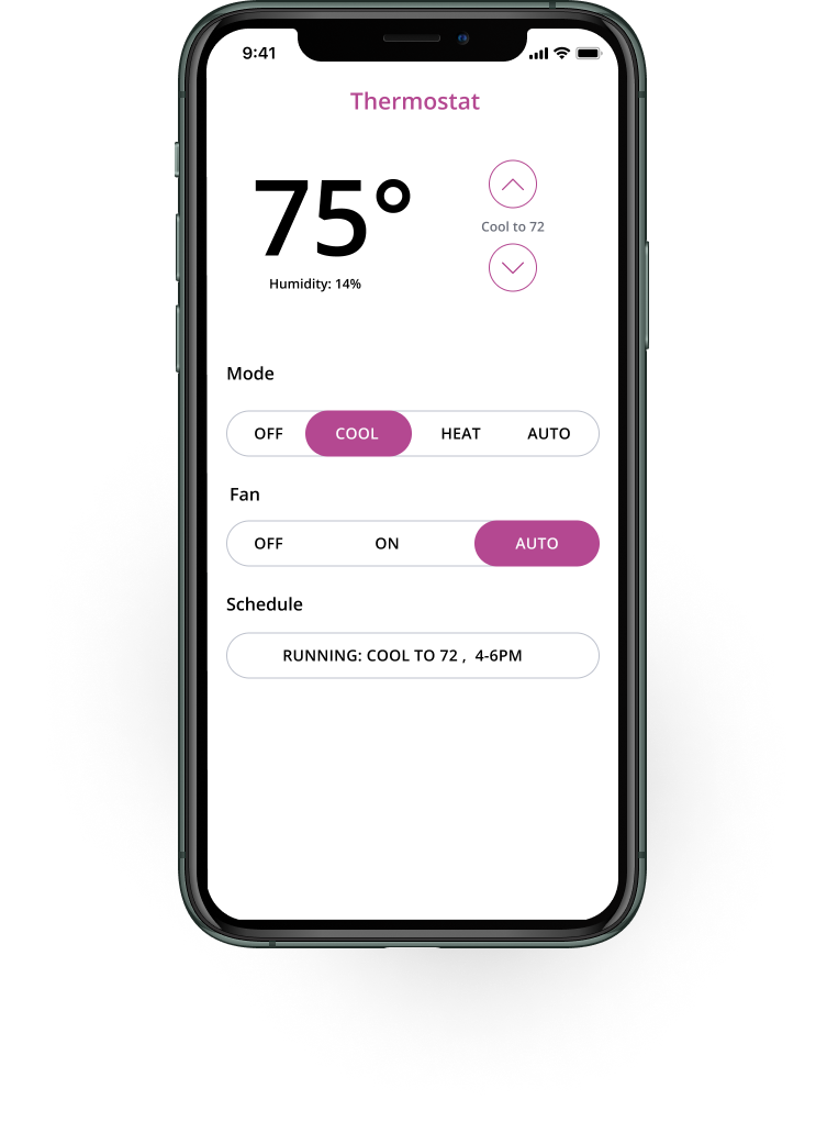
Another device redesign i was interested in testing was our thermostat design. I thought that the current design could confuse the user. My goal was to come up with a design that clearly showed the user the current temperature and what is was set to. I also wanted to show the user the other options their thermostat provided.
Current Design
New Design
What is the current temperature?
Current Design
Results
Current Temp 72: 74 responses
Current Temp 74: 24 responses
New Design
Results
Current Temp 72: 2 responses
Current Temp 75: 96 responses
As you can see there was clearly confusion on the current design regarding the current temperature. Clearly users thought that the largest number represented the temperature inside their home
What is the current fan mode?
Current Design
Results
On: 34 responses
Other: 64 responses
New Design
Results
On: 59 responses
Other: 39 responses
Which design do you prefer?
Current Design
Results
19%
New Design
Results
81%
Thermostat Conclusion
As we see from the results the new thermostat design conveys the information in a much more clear and concise way. It is not only an improvement on usability the users also preferred the design ascetically. I would say this is slam dunk change.