Product Designer
Webapp
Waste Management
The Big Picture
Zabble started as a powerful tool for contamination monitoring, but our users—recycling program managers and sustainability teams—were outgrowing it. They were juggling spreadsheets for outreach and separate tools for compliance, leaving them with fragmented data and slow workflows.
My Challenge: I stepped in to lead the transition of our web platform from a simple image-hosting dashboard into a robust, flexible program management tool. The goal wasn’t just to add features; it was to create a centralized source of truth for waste auditing and outreach.
The Problem: Data Rich, Action Poor
Through interviews with our power users, we found a recurring theme: they had massive datasets but no efficient way to act on them. Searching for specific images or metadata was a bottleneck, and every jurisdiction had a different set of rules for what they needed to track.
We identified two critical gaps:
The Rigidity Trap: Our system was too “fixed.” Users needed to search and filter by custom criteria that changed depending on their specific jurisdiction.
The Spreadsheet Fatigue: Outreach tracking was happening “off-platform,” making it impossible for managers to see the correlation between site visits and contamination trends.
Strategy 1: Outreach Tracker
Centralizing the “Human” side of waste management.
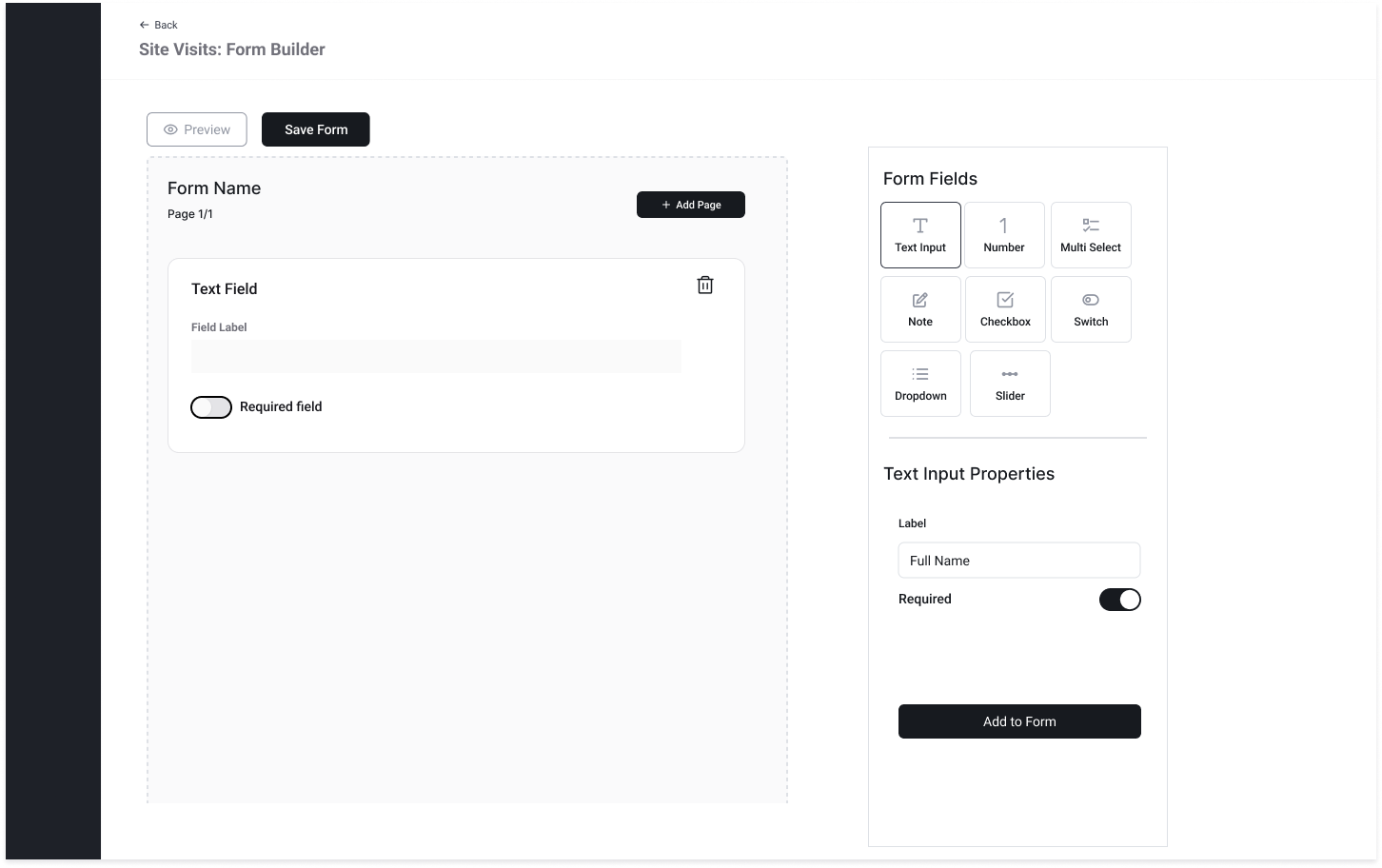
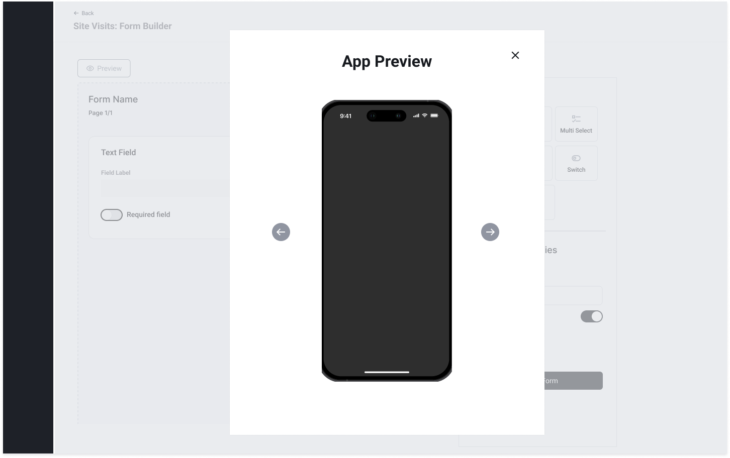
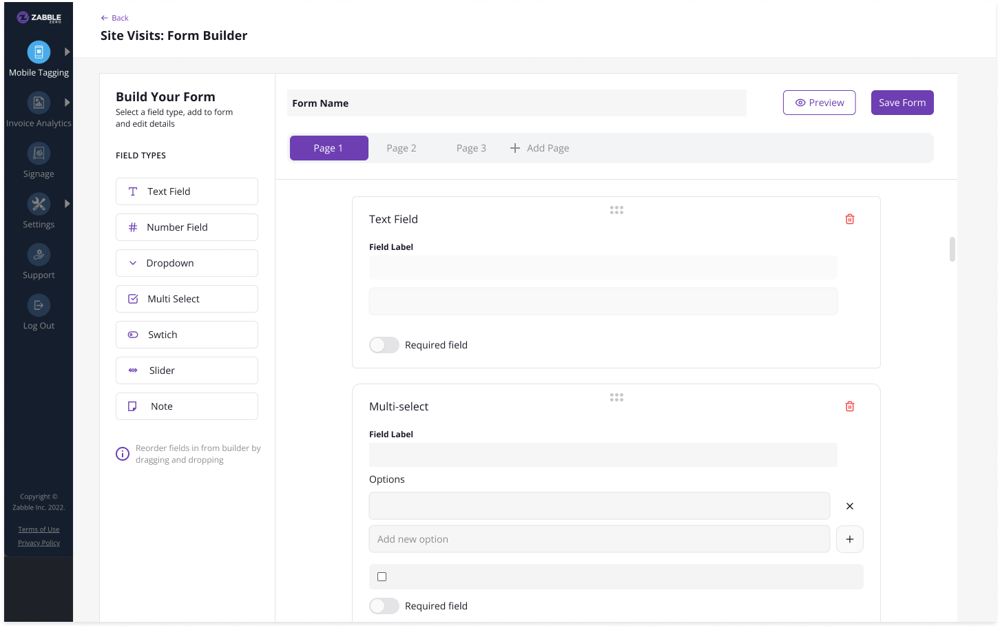
To help teams log site visits and compliance audits, I focused on building a flexible form system.
Bridging the Gap with Low-Fi: Early on, I leaned into low-fidelity wireframes in Figma. At a lead level, I find this is the best way to keep the team focused on logic and user flow rather than getting distracted by hex codes. It allowed us to rapidly iterate on how a program manager might build a custom site-visit form without writing a line of code.
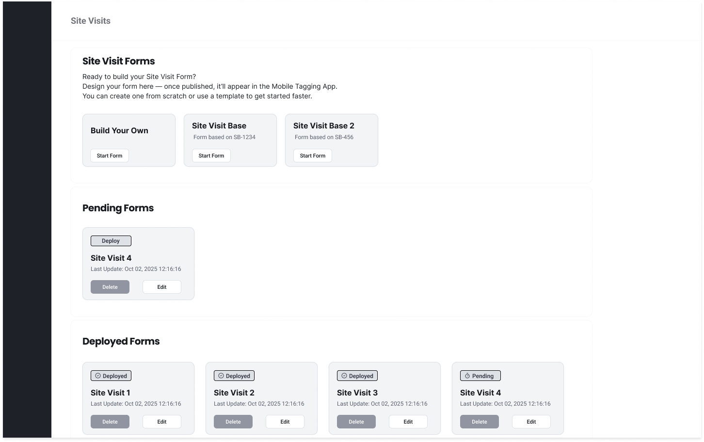
The Result: We created a unified experience where contamination data and outreach activity lived side-by-side, finally giving jurisdictions a 360-degree view of their programs.
Strategy 2: Tags Data System
Moving from “Static Images” to “Actionable Insights”
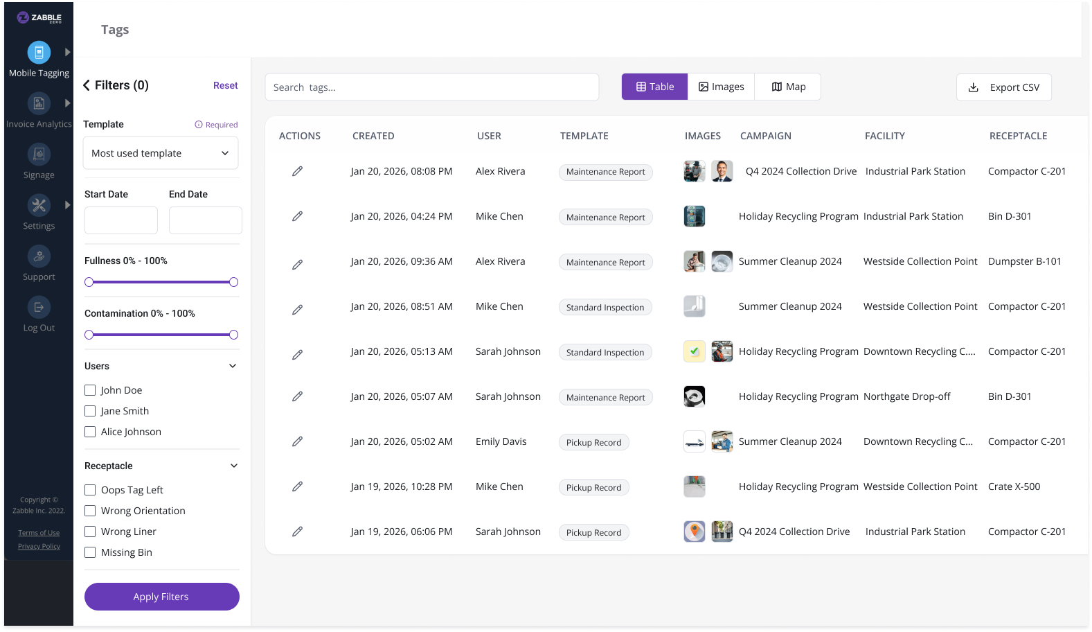
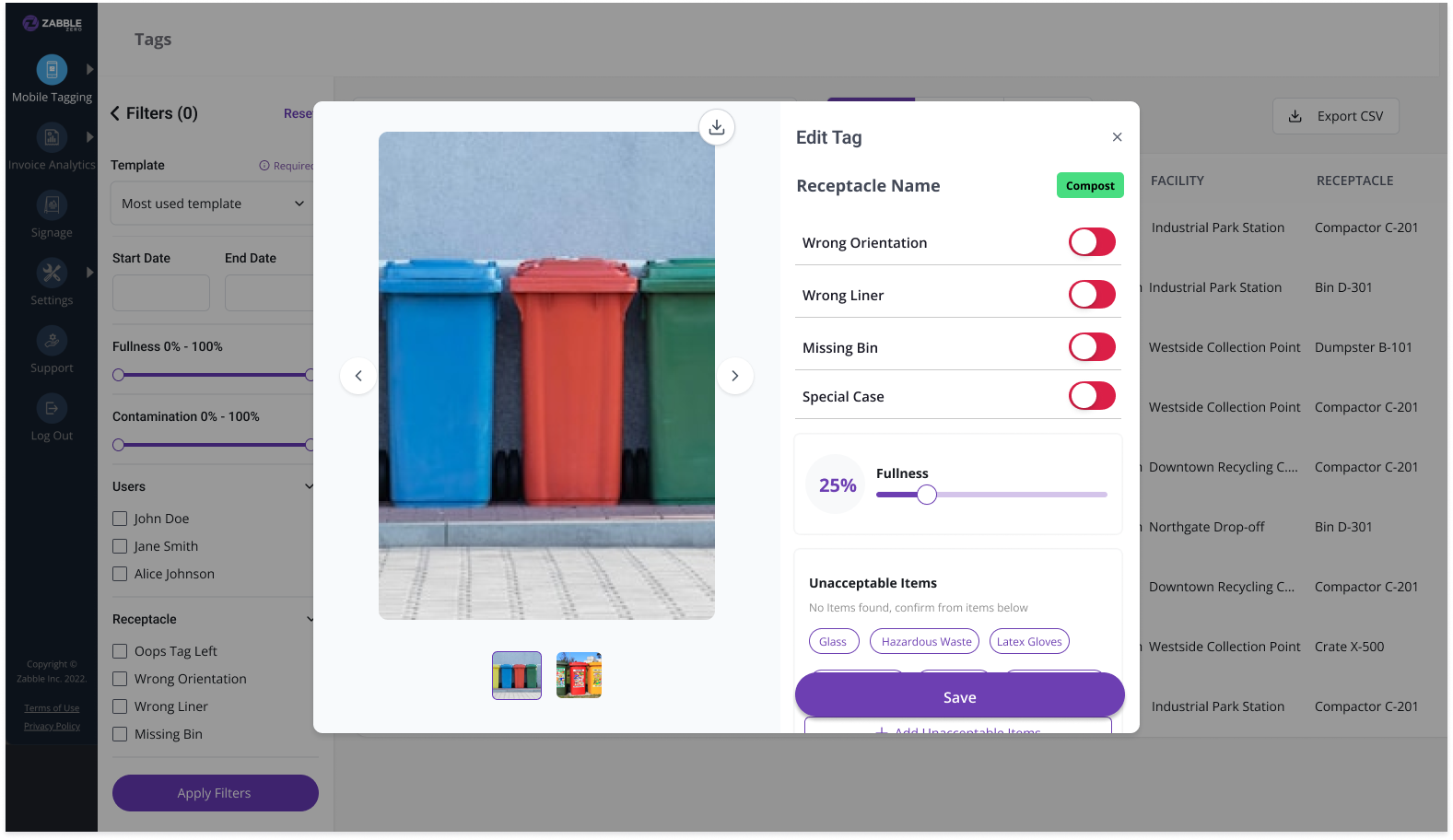
The core value of Zabble Zero is its data. Previously, the system treated uploads as a simple gallery of images. My goal was to transform this into a structured, high-performance data system that could handle hundreds of thousands of records without breaking a sweat.
The “Code-First” Design Approach For this phase, I chose to move out of Figma early and utilize a code-first prototyping approach (using Lovable). At a lead level, I’ve found that high-fidelity static mocks often fail to communicate the “feel” of handling massive datasets.
Validation through Prototyping: By building lightweight, functional prototypes, I was able to test table interactions, dynamic filtering, and sorting logic with real-world data volumes. This allowed the engineering team to identify performance bottlenecks and technical constraints before we committed to a final design
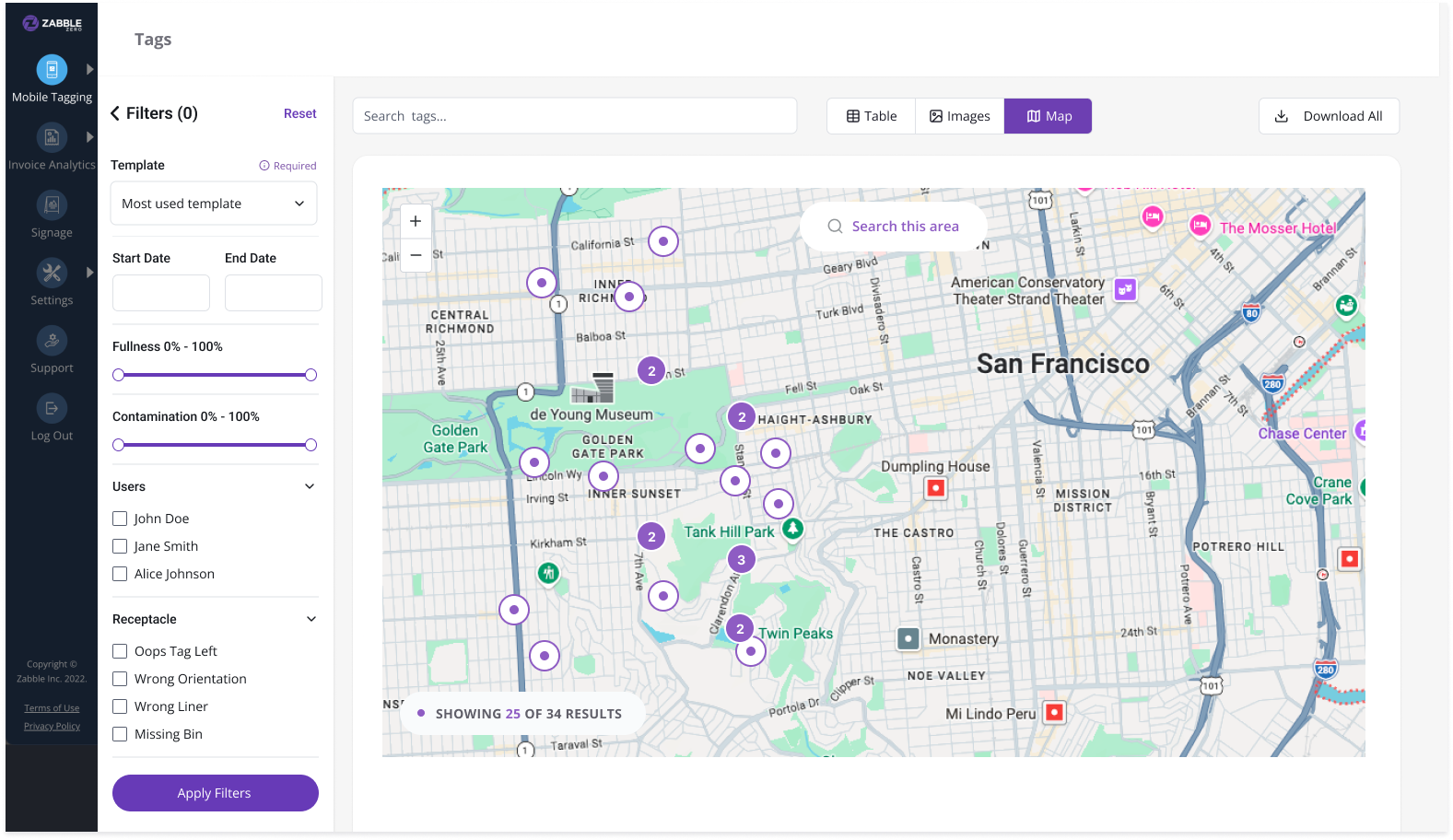
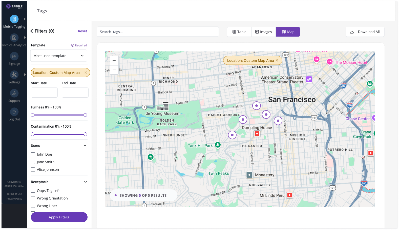
The Geospatial Layer: Based on team feedback, I integrated a map view. This wasn’t just for “visuals”—it allowed managers to see geographic clusters of contamination, turning abstract data points into a targeted outreach strategy.
Dynamic, Template-Aware Filters: Because every jurisdiction tracks different things, I designed a filtering system that isn’t hard-coded. The UI automatically adapts based on the user’s specific template fields
Density Over Decoration: Program managers often need to scan thousands of lines. I prioritized a column-based table layout that mirrors the spreadsheet experience they are comfortable with, but augmented it with instant CSV exports for compliance reporting.

Design Challenges
Designing for Hyper-Customization: Every city has a different “template.” I had to design a UI that was “platform-agnostic”—the filters and tables had to be smart enough to adapt to whatever data model the user defined, without breaking the layout.
Managing Data Density: When a user is looking at 100,000 images, “pretty” takes a backseat to “performant.” I prioritized a spreadsheet-style density that allowed for rapid scanning, while providing a map view for geographical context.
Maintaining the Ecosystem: Since field teams use our iOS app, the web editing experience had to feel like a natural extension of the mobile flow. I focused on “mental model alignment”—ensuring that a tag edited on the web mirrored the logic of a tag created in the field.
What's Next and Continuous Iteration
Design doesn’t end at “Ship It.” After launching the core Tags and Outreach systems, I shifted my focus to gathering post-launch signals from our power users (including teams at Stanford/PSSI). A lead’s job is to look past the initial success and find the friction points that only appear at scale.
1. Solving “Alert Fatigue” We discovered an unintended consequence of our success: because editing tags is now so fast and easy, users are triggering a flood of automated email notifications.
The Strategy: I’m currently designing “smart notification” logic—introducing batching and “same-day edit” rules to ensure we keep stakeholders informed without clogging their inboxes.
2. Optimizing for “Visual Scanning” While our table view is great for data density, our users told us they need more control over the Image View.
The Strategy: We’re iterating on adjustable thumbnail sizes and smarter “empty state” logic. The goal is to make visual auditing feel less like a chore and more like a high-speed review process.
3. Predictive Waste Patterns Now that we’ve centralized the data, the long-term vision is to move from reactive reporting to predictive insights.
The Strategy: I’m beginning to explore how we can use the historical outreach data alongside contamination trends to suggest where a team should visit next—turning Zabble into a proactive consultant for these jurisdictions.
What I learned
Every project has its “aha” moments, but Zabble Zero specifically reshaped how I approach complex, data-heavy products.
1. Design for Systems, Not Just Screens When you’re dealing with a platform that needs to serve dozens of different jurisdictions, you can’t design fixed layouts. I learned to think in adaptive UI patterns. My focus shifted from “how does this look?” to “how does this system behave when a user adds 10 custom fields we didn’t plan for?”
2. Speed is a UX Feature When a user is managing hundreds of thousands of data points, performance is the user experience. A beautiful interface that takes three seconds to filter is a failure. This project reinforced the need to partner with engineering early to ensure that our search and sorting logic felt “instant,” regardless of the dataset size.
3. The Power of “Code-First” Prototyping Moving out of Figma and into functional prototypes (using Lovable) was a game-changer. It allowed us to feel the friction of the data interactions in a way a static mock never could. It taught me that as a Lead, choosing the right tool for the specific problem—whether that’s a whiteboard, a wireframe, or a coded prototype—is half the battle.
4. Alignment Over Perfection Working in a small, fast-moving team means you don’t always have the luxury of a six-month discovery phase. I learned that getting a “good enough” low-fidelity flow in front of the team to spark a conversation is often more valuable than spending three days perfecting a high-fidelity mock-up that might be technically unfeasible.