Design a more user friendly Admin Portal for credit union and community bank employees to use, specifically with a way to configure the Account Opening product instead of contacting our customer support team and waiting for engineers to manually update the code to reflect changes
Customer Pain Points from User Interviews
Customize the branding for OAO so that I can change copy, the color scheme and upload logos as needed.
Customize the copy for OAO application so that I can change the text as needed.
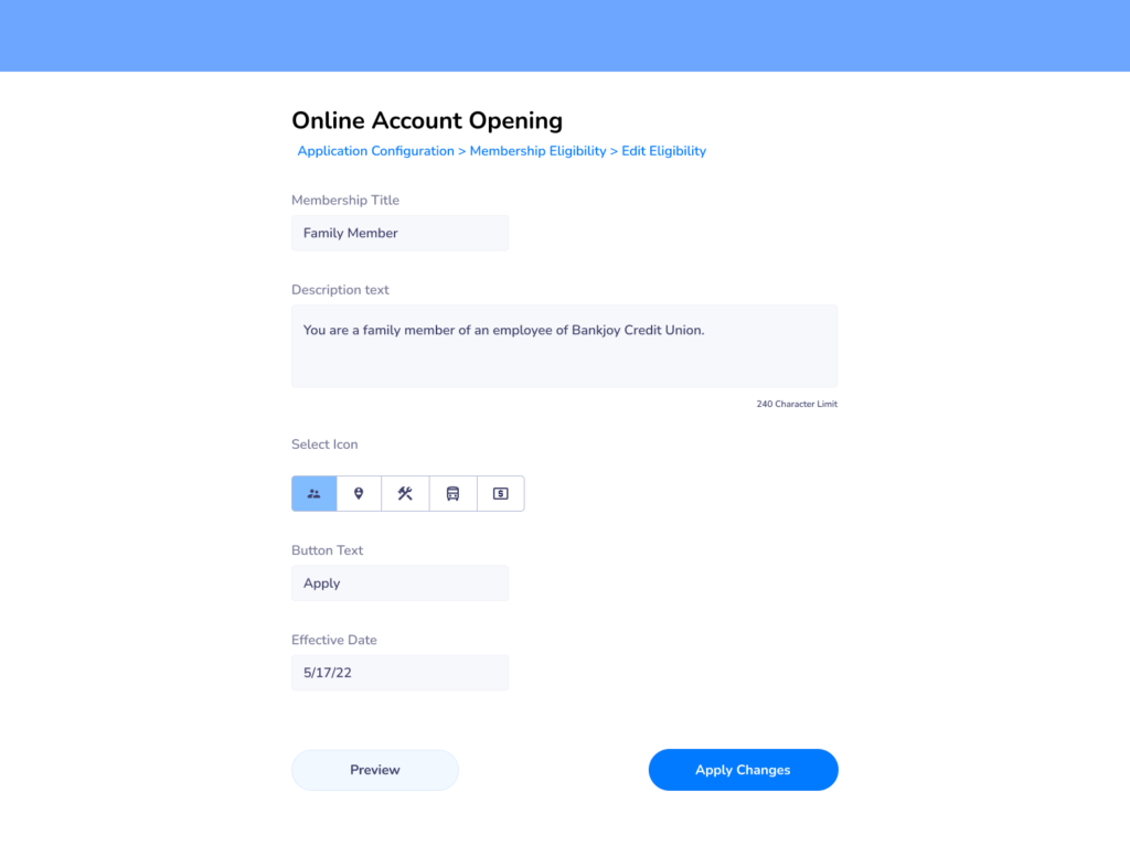
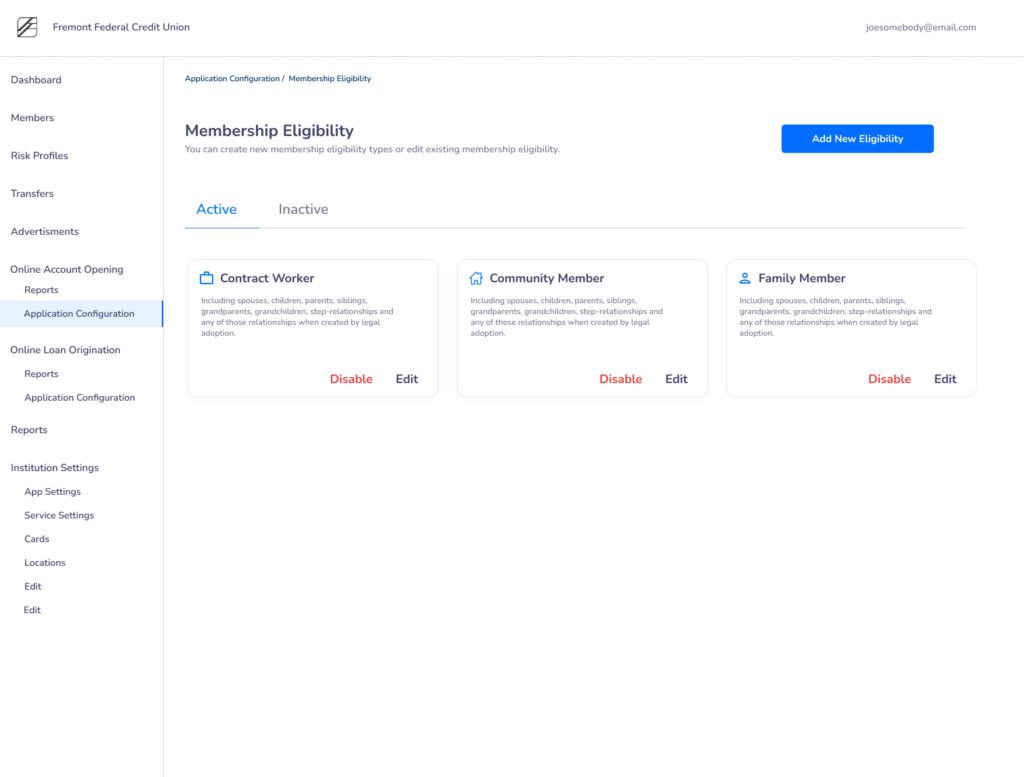
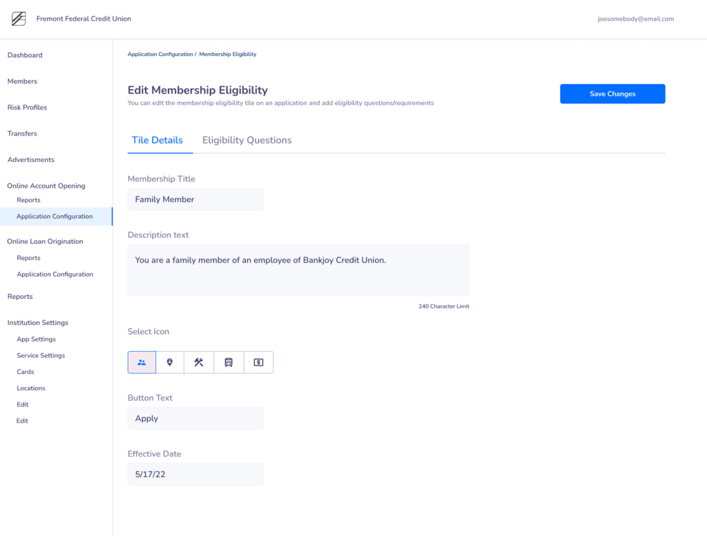
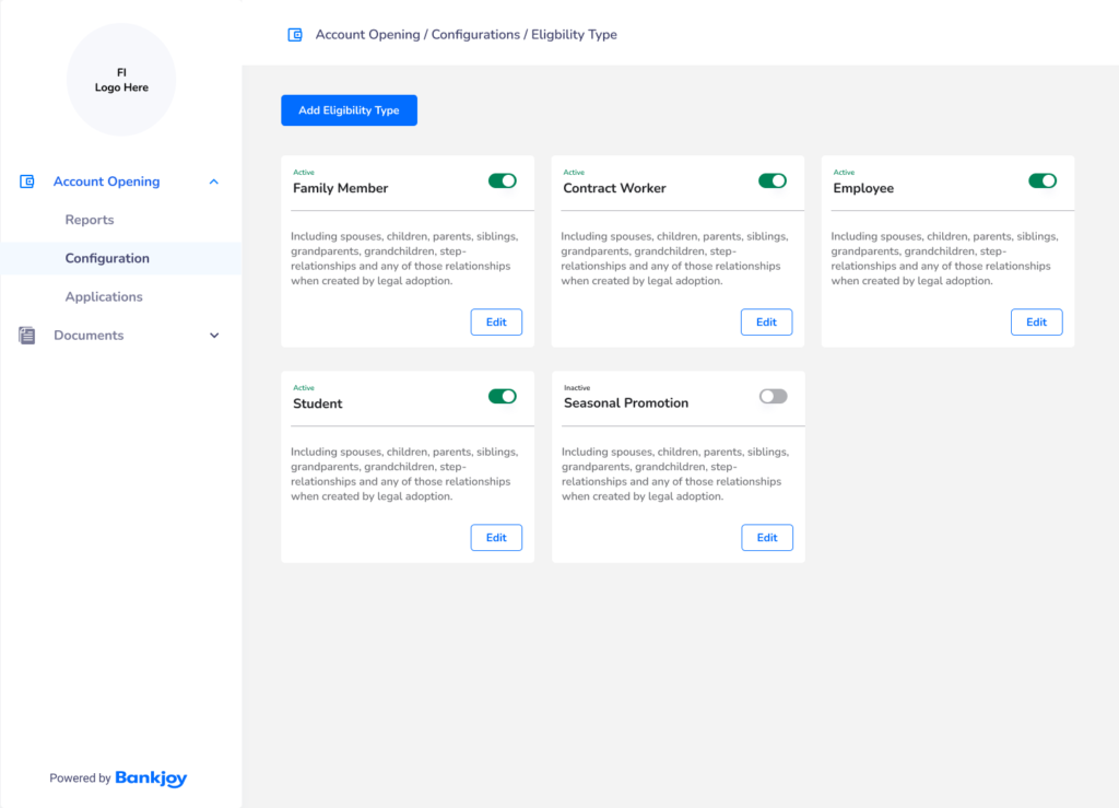
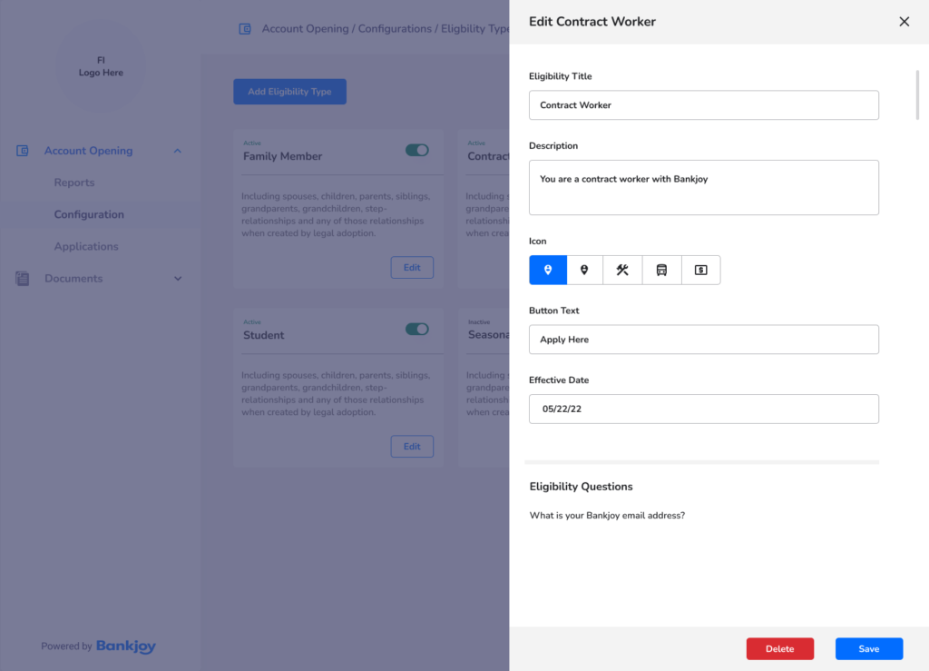
Create custom membership eligibility tiles so that I can update eligibility requirements at any time.
Ability to toggle sections of the application on and off so that the Credit Union can collect as little or as much information from the applicant.
Re-Activate Application after expiration.
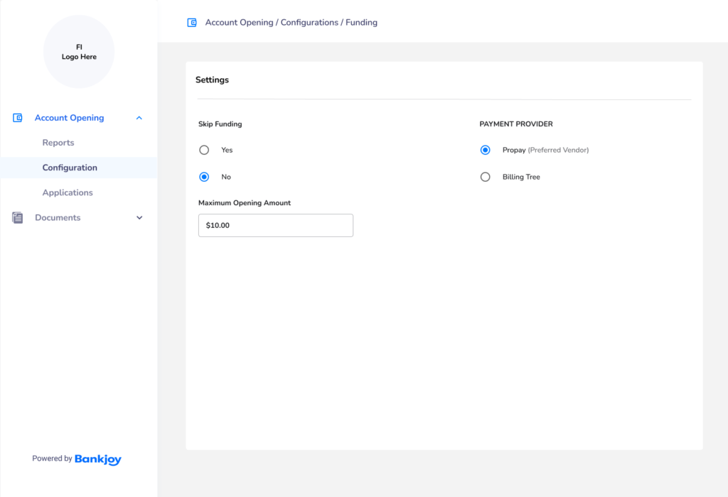
Configure the Minimum and Maximum funding amount so that this can be adjusted and configured by the Credit Union.
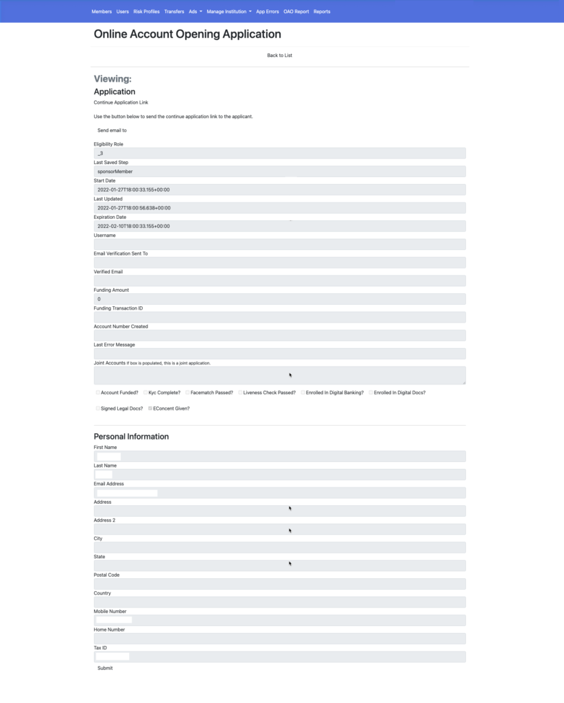
Current Admin Design
The current application design had a top navigation bar and used form fields listed vertically for all the information. The check boxes had poor contrast as well.
The report design was not visually helpful to the user. There was no visual hierarchy to guide the users eye to the important information.
Wireframes & Research
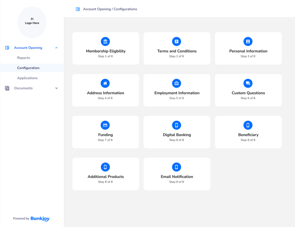
The first step in the design was to figure out what additional pages we would need for the account opening configuration and how the user would interact with them in version 1.
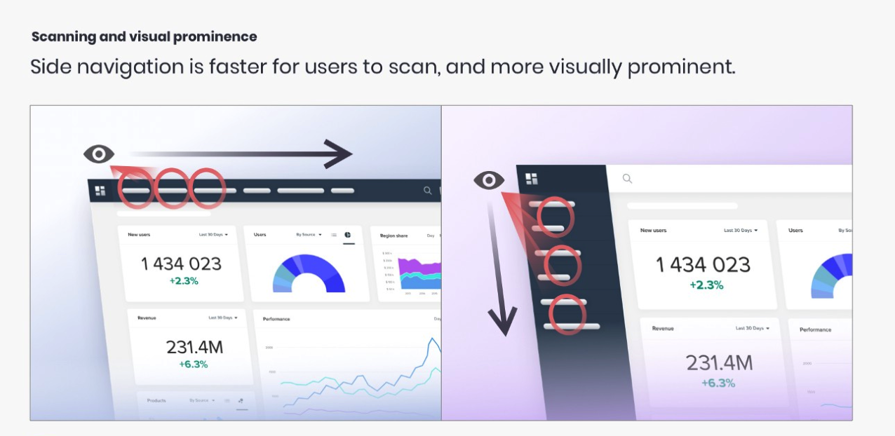
The next step was to experiment with ideas to make the information more visually appealing to the user. I continued to use the top bar in the first designs, but based upon research I have done in the past, left side navigation is a better user experience.
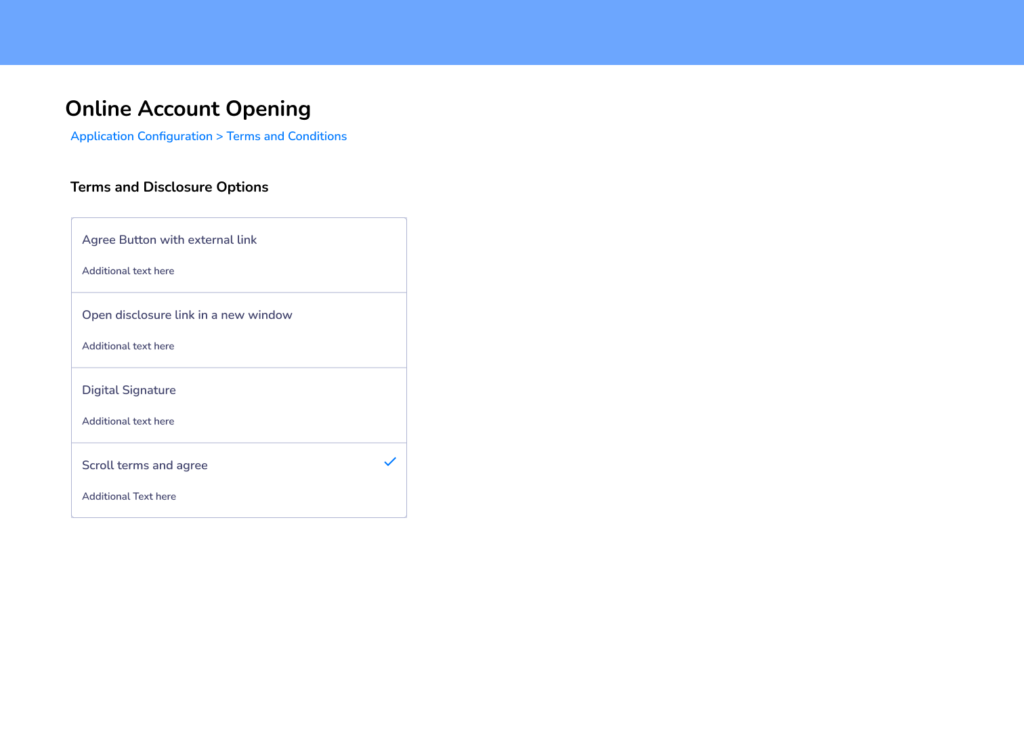
My second iteration involved experimenting with a side and top bar. One of the most difficult screens to design was this membership eligibility page. This was my first iteration of having text buttons on the cards.
As I dabbled with this design I found that there were too many levels especially when you edit eligibility.
Final Design
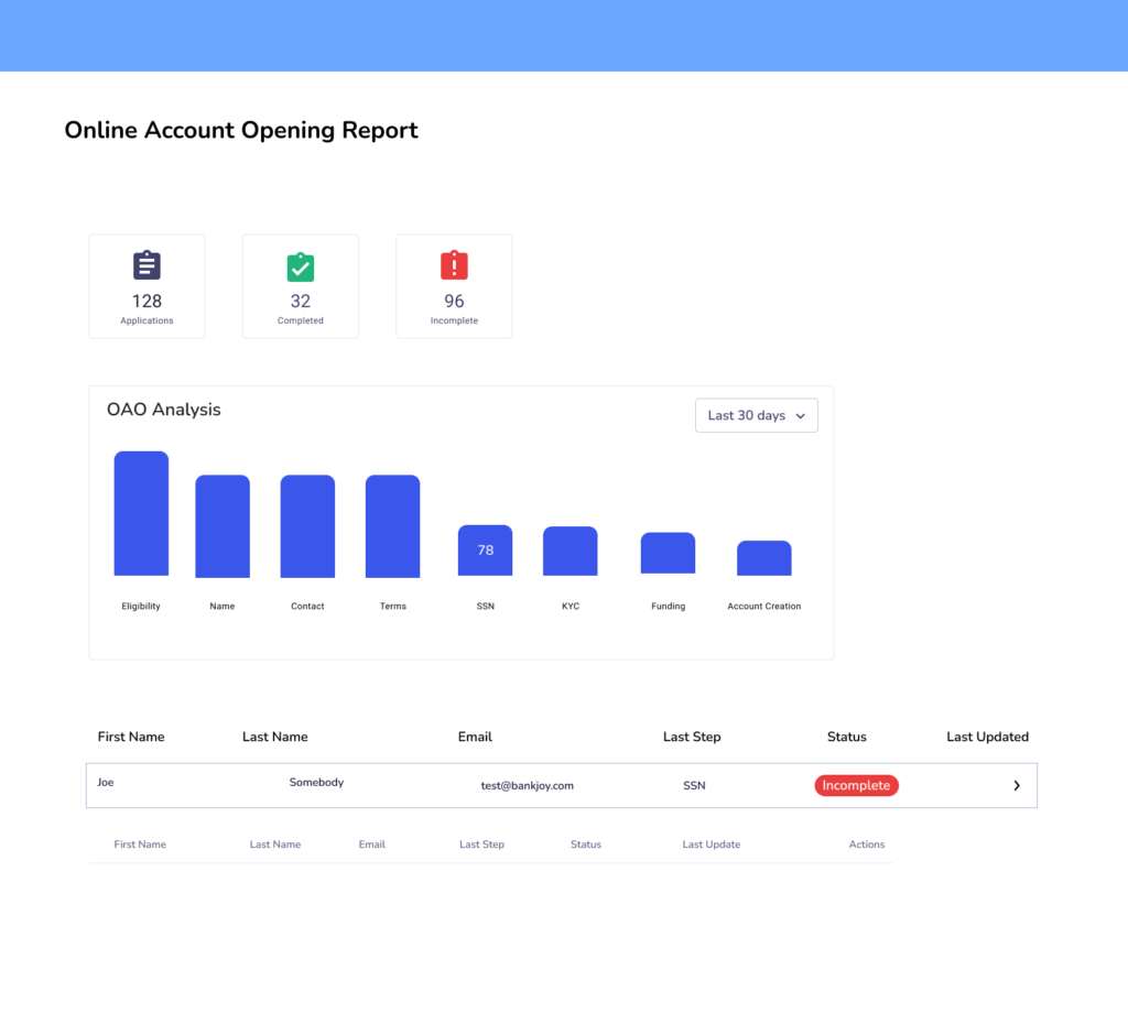
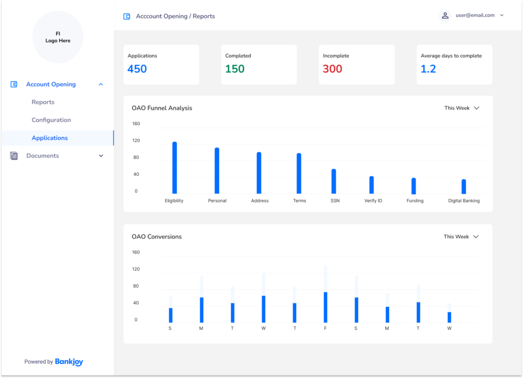
For the final design I decided to use numbers for the report dashboard and remove the icons reducing cognitive load and allow the user to quickly see key statistics
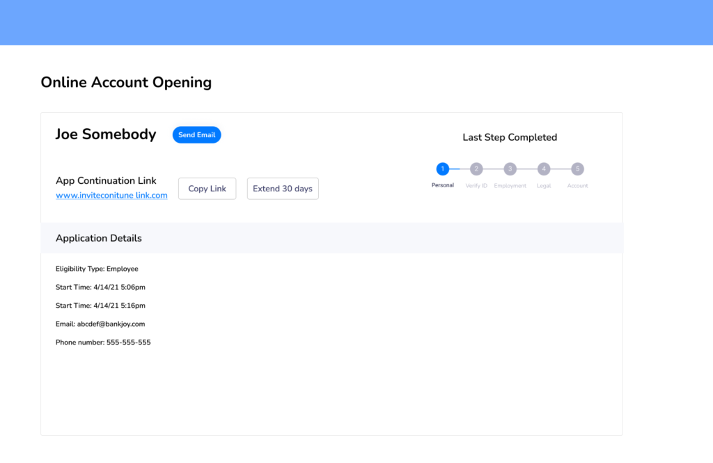
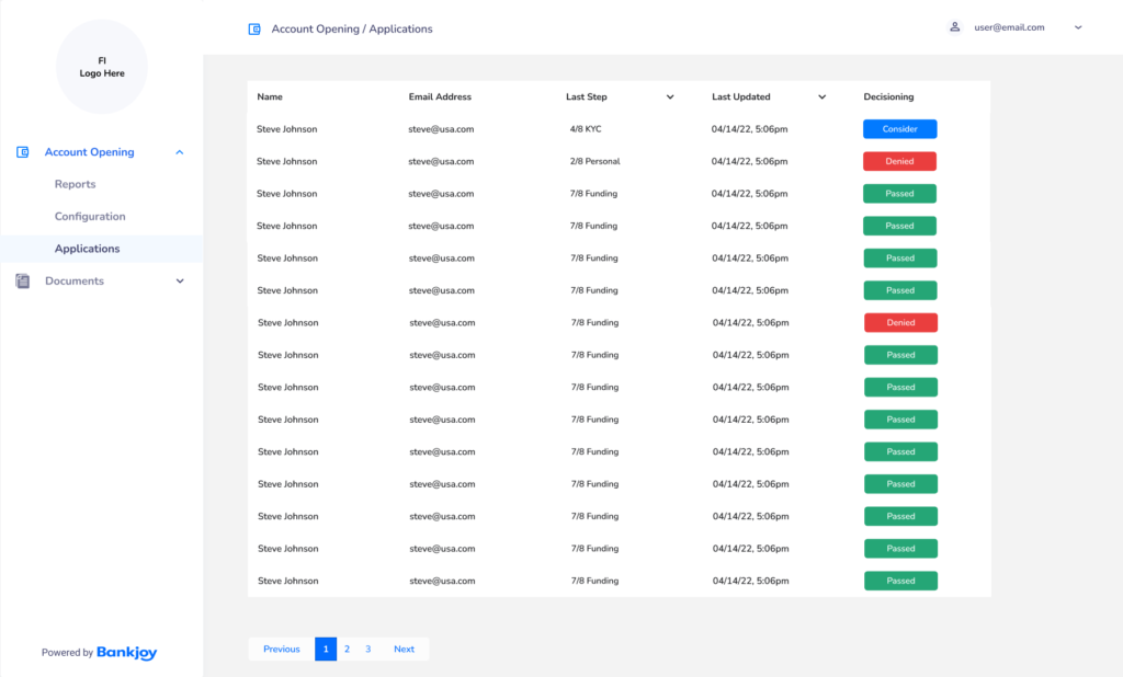
This is the application list screen was made into a sortable table view with color added to show the user the incomplete applications that need their attention.
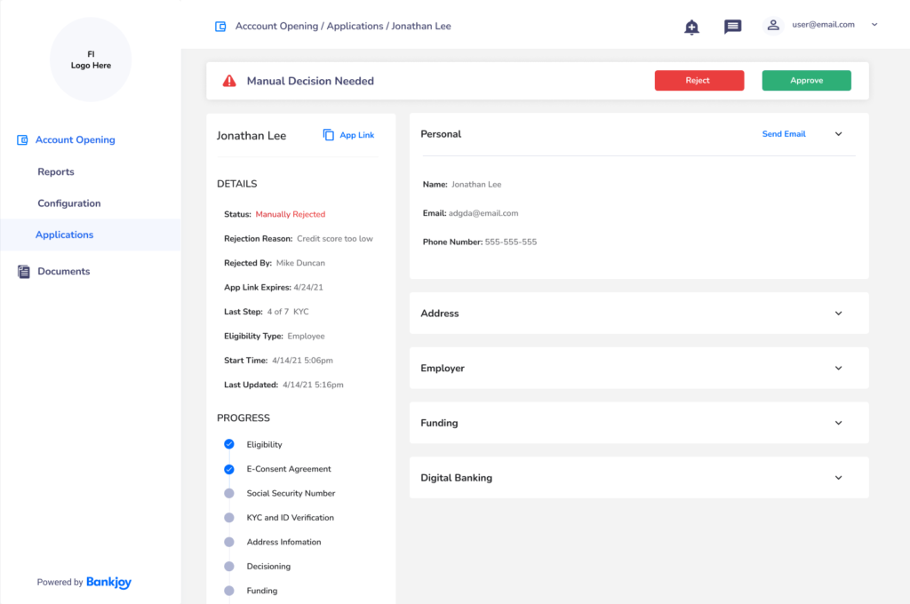
This was a modification for any applications that would need to be manually reviewed.
This is the application details screen. I made the progress checkboxes much more relevant and used collapsable cards to let the user control how much information they want to see.
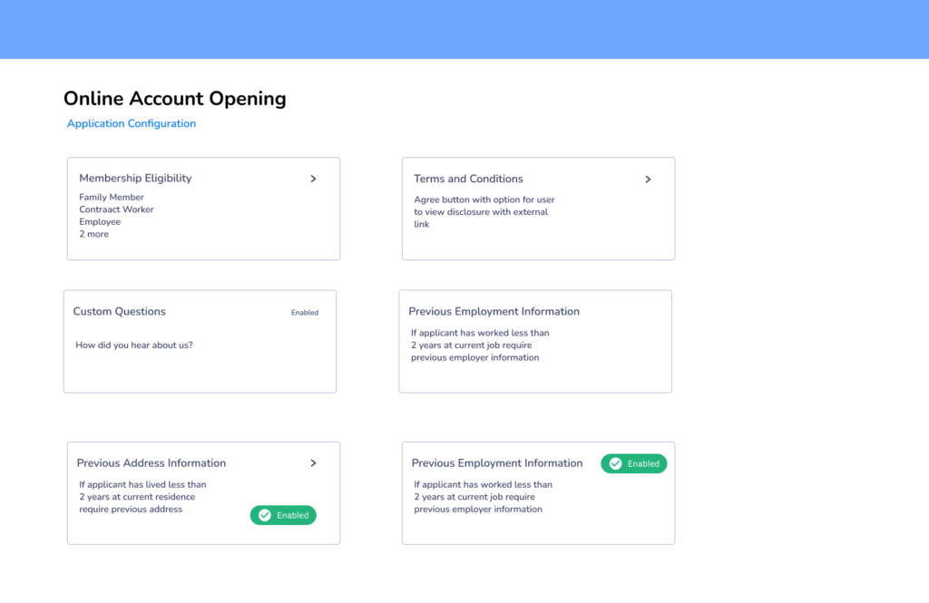
I was most proud of the membership eligibility design. I added a toggle to the top right and a slide out drawer to edit the eligibility type.
“It reminded me of an Apple product, like an iPhone. It was incredibly easy to figure out where everything was at”