Smart Home Experience
Skin in the Game — i.e., having a measurable risk when taking a major decision — is necessary for fairness, commercial efficiency, and risk management, as well as being necessary to understand the world.
This was the reason for installing the SmartRent device in my home. It gives us as designers/engineers/developers/product/support a more realistic user experience when you have something at stake when using the SmartRent system. It is one thing to test remote devices in the workplace with no consequences if there is a failure. It is another when you are unsure if the request you sent to lock your front door was accepted and completed and your house may be unlocked but are not notified that your request failed. Below are some observations and suggestions for improvements to the SmartRent Resident app.

UX Feedback Principle
Feedback: what is it doing?
Feedback is about sending back information about what action has been done and what has been accomplished, allowing the person to continue with the activity. Various kinds of feedback are available for interaction design-audio, tactile, verbal, and combinations of these.
It’s the confirmation that an action was performed. It informs the user that, yes, their input was received and is being acted upon — whether that action is successful or fails is also communicated. All feedbacks need to be immediate and synchronized with the user action. This enhances the user’s overall experience, so they aren’t left wondering what happened.
My Feedback Experience
There is no feedback or confirmation that my requested action was received or failed unless I am looking at the specific device that I am trying to control. This is not a big deal for the a light switch but when it comes to Locks and Thermostats, I want to know that the lock request I sent to lock the door was received and being processed.
Another issue is that when I send a request to lock the door the button to unlock the door is still available to me to press. A more effective interface would be to gray out the unlock button until we have verification of success or failure with the lock command.
Hub Connection: There were several times where I pushed the on/off functions on a smart plug and nothing happened but the state on the app changed. I was at a loss for what the problem was. Was my hub down? Did my request to change the state of plug not send from my phone?
The problem wasn’t that the plug didn’t work, it was I had no idea why it didn’t work and how to troubleshoot the issue. I would have felt much better if I received a feedback message about why my request did not go through.
UX Halo Effect / Negativity Bias Principle
The halo effect allows us to make snap judgments, because we only have to consider one aspect of a person or design in order to “know” about all other aspects.
Negative experiences have stronger emotional impact on humans than positive experiences do. Thus, in designing the user experience, we need extra emphasis on avoiding those lows.
My Halo Experience
While using the SmartRent App I was also affected by the Halo effect. Once I experienced my devices not working with no feedback I began to doubt if any of them worked if I was not in my home to verify that they worked. Since I had a bad experience with the Smart Plug it extended into my attitude of reliability in the entire app.
One of the main advantages of the smart home is that I can control devices in my home remotely and trust that they work(or will be given feedback that they didn’t). Now that I had a bad experience I am in the habit of double checking or have to be in listening range of my door lock to verify that my request to lock went was sent to the lock and completed.
Usability Heuristics
Help users recognize, diagnose, and recover from errors
Error messages should be expressed in plain language (no codes), precisely indicate the problem, and constructively suggest a solution.
Even though it is better if the system can be used without documentation, it may be necessary to provide help and documentation. Any such information should be easy to search, focused on the user’s task, list concrete steps to be carried out, and not be too large.
My Usability Experience
This experience ties in with the previous discussed experiences. I think our help and documentation can be improved to aid users in being able to troubleshoot and fix errors on their own.
One option to explore is to provide videos or animations to show users features of the app or help with troubleshooting. Short videos are easier for the user to watch vs searching and reading through a bunch of text to find the answer.
The Add A Scene function should not exist on the front page unless we provide a quick tutorial about what a Scene is and how it can make the user’s life easier as the first screen. Watching a user unfamiliar with the SmartRent app had no idea what a scene was because as they clicked on the Add A Scene button on the dashboard they went directly into name a scene with no context of what was going on. Even upon completion of creating a scene she did not understand the point of a scene or the benefit. An illustration and helpful description should also exist on the Scenes empty page.
No activity registers on the leak sensor screen. Even though the leak sensor makes noise when it detects water I have no way of verifying that the leak happened.
UX Questions to Explore
Is one tap actions for devices preferred?
How often do users unlock or lock doors with app vs manually?
Would users prefer a device based bottom bar?
How would users group features (card sort: security includes lock sensors, devices grouped by rooms, etc)?
How likely are renters to buy additional smart devices (marketplace feature)?
What are the most desired smart devices?
What devices are most often controlled by the app?
Do users find scenes useful?
Is it too much work to create a scene? Can it be easier?
Would a better tutorial help them create more scenes?
Are scenes a super user function? Should it be placed in a different area in app?
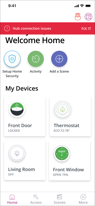
Suggested Improvements: Hub Status
Most device issues are caused by a hub connection issue. A icon in the top bar and a warning banner will keep users informed and fix issues.
Current Design
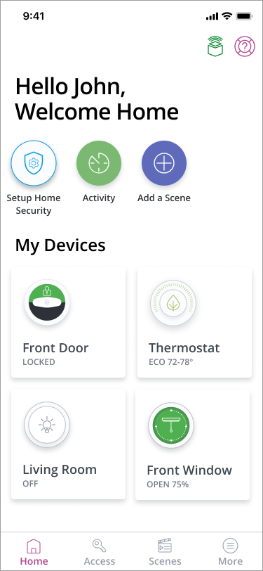
Suggested Design