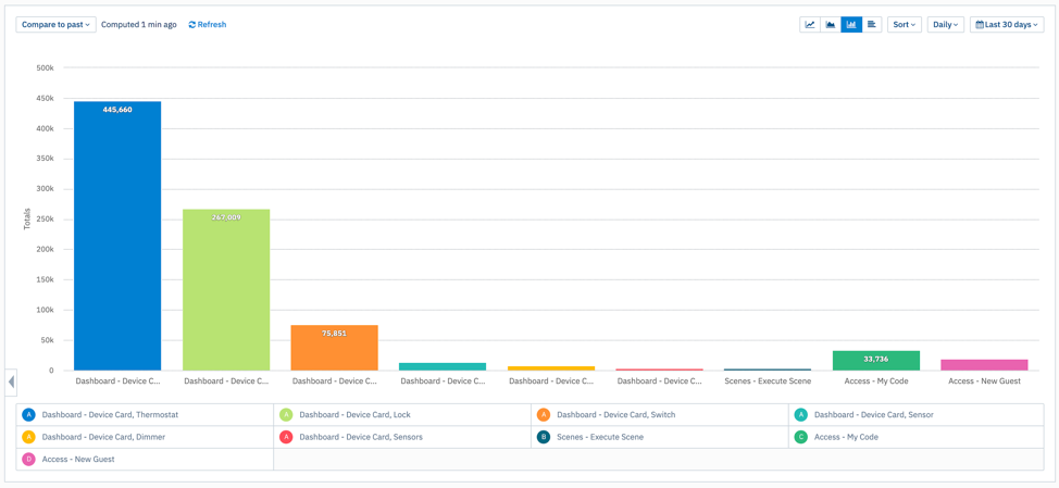
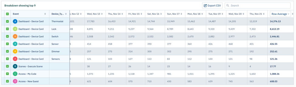
Based upon my UX audit of the SmartRent resident app and reviewing the app analytics i wanted to increase usage of the Scenes feature. Without being able to speak directly with the residents, I dove into our analytics tool to find out if people were using the scene feature.
The data above shows that Scenes were some of the least used features in the app. My hypothesis was that users did not know what a scene was and they saw no value in creating one. My redesign idea was to shorten the scene creation process and explain to users what a scene is and how it works.
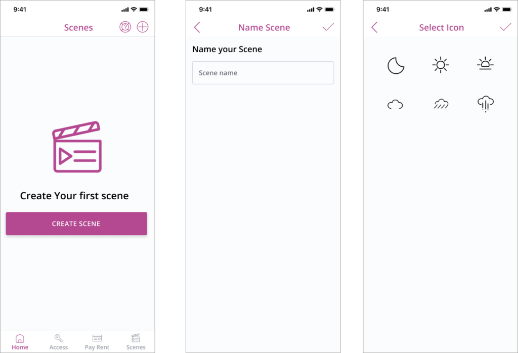
Current Design
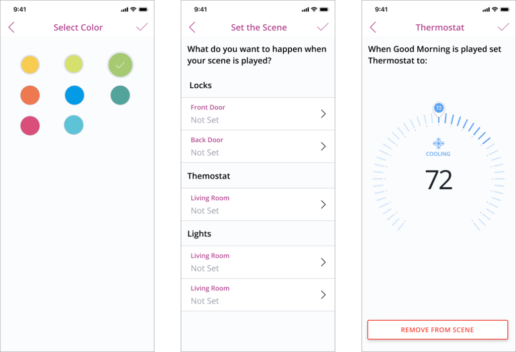
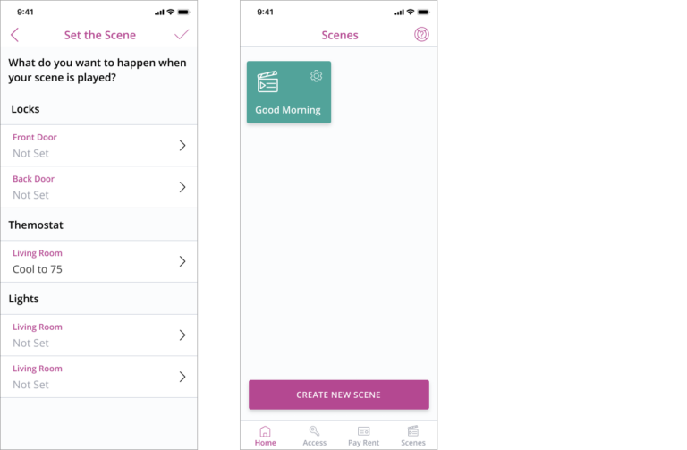
In the current design we do not explain what a scene so there is no value to the user taking the time to set up a scene. Another issue I identified was that we show the actual device control screen (thermostat view) when setting up a scene which is confusing to the user.
Proposed Design
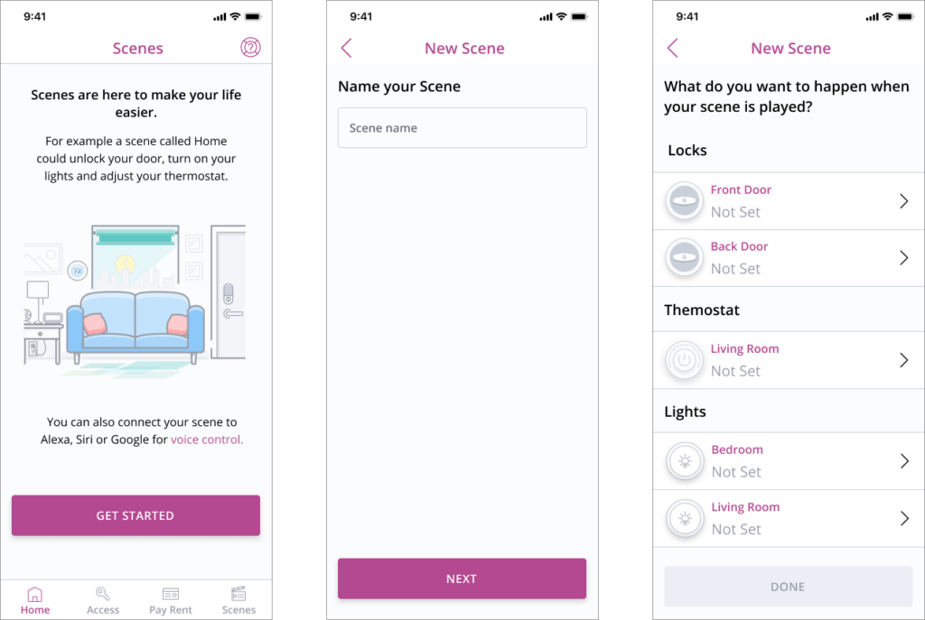
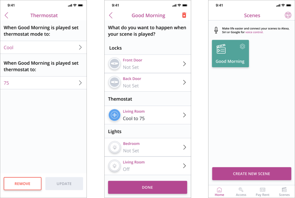
The biggest change in the proposed design is displaying a more informative landing page to give the user an idea what a scene is. This design also eliminates the steps of selecting a color and icon for the scene. The idea was to use a generic icon like the play button then auto generate a color that is in or design system. This will eliminate steps fo the user. I also incorporated a device icon with color that indicates what device is used in the scene. Moving the update button to the bottom of the outcome screen was based upon previous user testing that showed a checkmark in the top right of the screen was often missed by the user.
Ring Integration
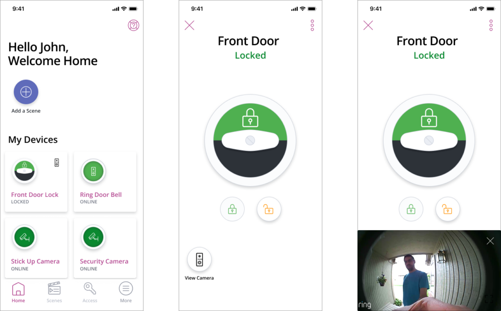
A feature that we added to the SmartRent Resident app was the ability to pair and use Ring Devices in the app. When the feature was pitched we on the UX team wanted to make sure that the Resident App user could control their door lock while viewing their ring door bell. We thought this added value to the user would encourage people to use our Resident App vs the Ring App. Another item we needed to incorporate into the design was a history view of past ring and ding events.
1st iteration
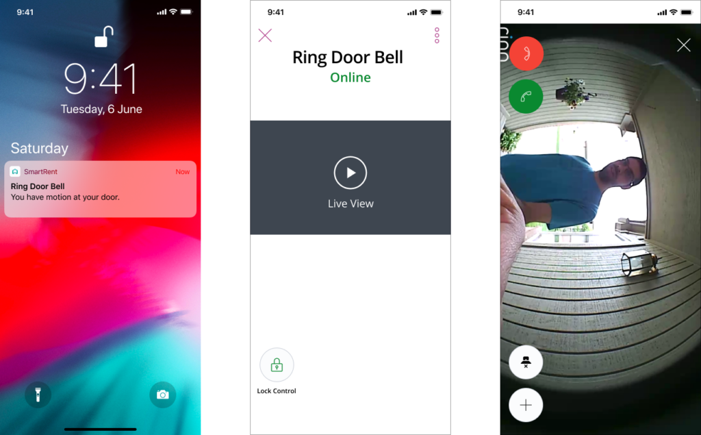
My first iteration was having a button located on the lock screen which would open a video on the bottom of the screen while still leaving the lock controls on the top of the screen. Also on the Welcome screen we wanted to put a ring doorbell icon in the left hand corner of the lock card to show that there was a connected device.
2nd iteration
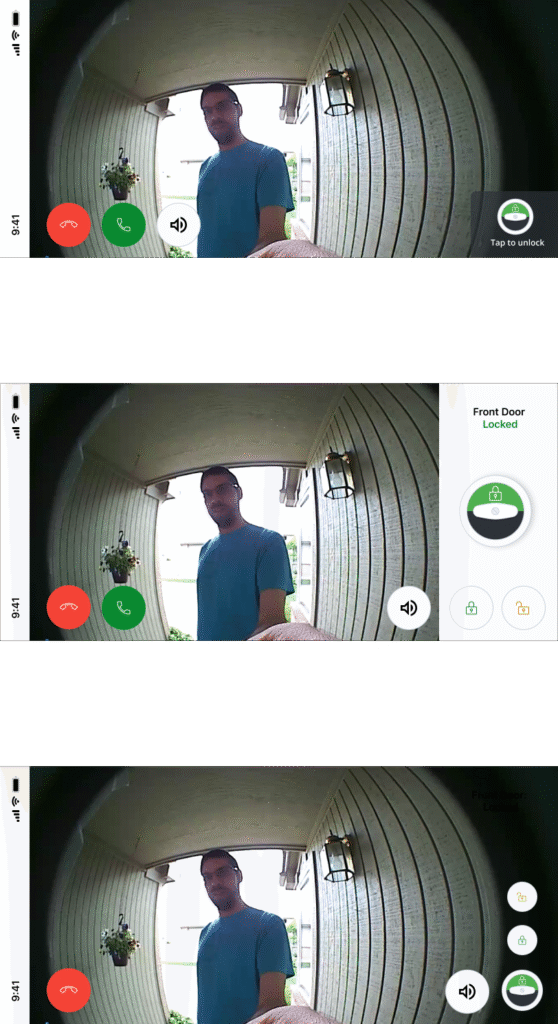
Our second iteration was adding a visual the lock controls exculusivly to the live view. One consideration what we pushed for was for the status of the lock (locked/unlocked) to be visible with the controls to make sure the user didn’t mistakenly leave the door unlocked.
Final Design
The video below shows the final version of the design with the interactions.